Project overview
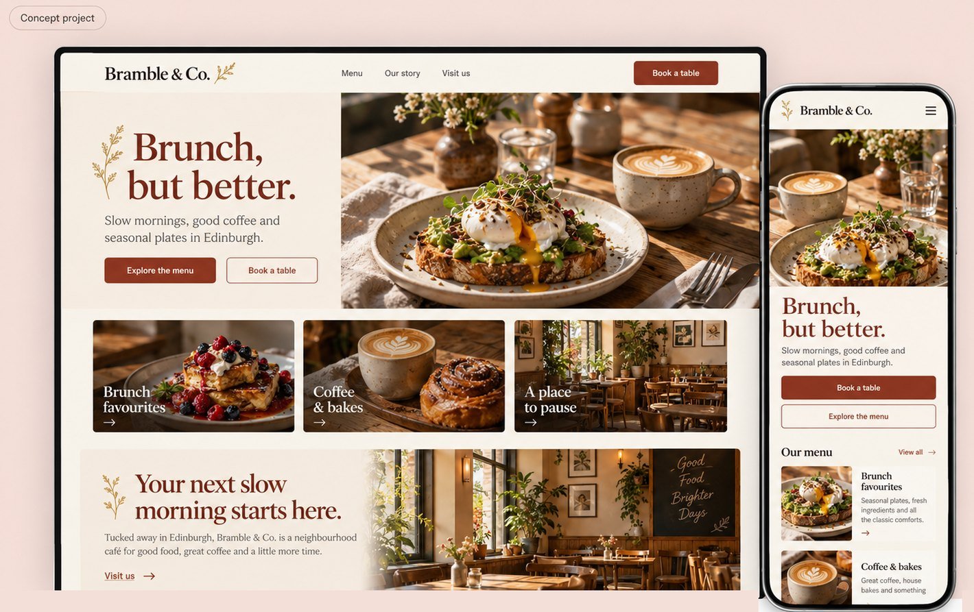
Bramble & Co. is a fictional Edinburgh café created for an independent brand and website exploration. I developed a wordmark direction, a warm colour palette and a food-led homepage concept. The desktop and mobile compositions connect the café atmosphere with two practical tasks: exploring the menu and starting a table reservation.
The challenge
A café website needs to communicate its character quickly while helping someone decide whether to visit. Beautiful photography alone cannot answer questions about the menu, location or booking. The brief was to balance an editorial food presentation with visible actions and a simple route to practical information.
Audience and assumptions
The assumed audience includes local brunch visitors, people meeting friends and visitors discovering the café through social content. Some want to browse before booking; others arrive ready to choose a table. These are design assumptions, not validated customer segments or findings from a live business.
Design approach
I used terracotta, cream and expressive serif typography to establish a warm identity. The hero combines a short proposition with brunch photography and menu and reservation actions. Three image cards introduce brunch, coffee and the café setting. The mobile direction keeps booking and menu access visible beneath the hero.
Scope and responsibility
The completed work covers a brand direction, desktop and mobile homepage visuals, interface copy and an AI-generated food photograph. Detailed menu pages, reservation screens and social templates remain proposed. No café launch, reservation integration, customer study or commercial performance result is claimed.
Visual direction
Imagery, colour and type

Typography: DM Serif Display for the wordmark and editorial headings, paired with Inter for body copy and controls.
Design decisions
Key decisions
Build the identity around the café atmosphere
A serif wordmark, small botanical detail and warm neutrals give the concept a recognisable character. Terracotta anchors headings and actions. The next identity phase should create editable vector artwork and check the mark at small sizes, on menus and on signage.
Let the food lead without hiding the menu
The hero photograph communicates the brunch offer at a glance. Explore the menu remains visible next to the booking action, with category cards immediately below. A proposed live-text menu would show dish descriptions, prices and verified dietary information.
Keep discovery and reservation connected
Book a table should open a reservation journey with party size, date and available times. The homepage concept does not establish that inventory exists. A working flow must handle no availability, a slot becoming unavailable and a final confirmation that repeats the selected details.
Extend the visual language into social content
The same photo treatment, colours and type pairing can support menu highlights, café moments and visit information. Suggested formats are a 1080 × 1350 px feed post and a 1080 × 1920 px story. These are a direction for future templates, not a delivered social campaign.
Proposed journey
From first visit to next step
- 1Explore the menu
- 2Choose Book a table
- 3Enter party size and date
- 4Select an available time
- 5Add contact details
- 6Review and confirm
- 7See reservation details
This is the proposed integrated flow. If only an enquiry form is available, it becomes Request a table with a pending status. These screens are planned, not yet designed.
Concept outcome
The concept creates a coherent café identity and a clear visual route from food discovery to reservation intent. No increase in bookings, footfall or social engagement has been measured. The next step is to prototype the menu and reservation journey, then test whether visitors can plan a visit without missing information.
Reflection
The strongest part of the concept is the link between atmosphere and action. The next iteration should bring menu detail, visit information and booking states up to the same level of care as the homepage photography.
Your project next
Creating a neighbourhood favourite?
Share what you need. You'll get honest advice, a clear plan and a fixed quote.