Project overview
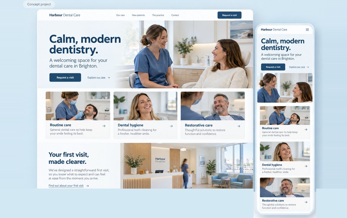
Harbour Dental Care is a fictional Brighton practice used for an independent website concept. I developed a welcoming homepage direction and a proposed appointment enquiry journey. The design brings care categories, practice imagery and a clear next step together across desktop and mobile.
The challenge
A prospective patient may want to understand the practice before making contact. The brief asks the website to explain what care is offered, introduce the setting and make the first step easy to find. The challenge is to support this decision with clear information and a calm interface, without making promises about treatment or availability.
Audience and assumptions
The assumed audience includes local adults researching a practice, people arranging routine care and visitors who want reassurance about a first appointment. Some may browse on a phone or prefer to speak with the team. These are working assumptions for the concept, not findings from interviews, a completed UX audit or live patient data.
Design approach
I placed the care offer, Brighton location and Request a visit action in the hero. A conversational photograph introduces the practice atmosphere. Three care categories support exploration, followed by a first-visit section. A restrained navy and powder-blue palette keeps headings and actions clear while allowing the imagery to lead.
Scope and responsibility
The completed artifacts are desktop and mobile visual concepts, interface copy and an AI-generated hero photograph. The enquiry flow, detailed care pages and usability checks are proposed next work. There is no live booking integration, clinical assessment, patient research or measured performance result in this project.
Visual direction
Imagery, colour and type

Typography: Inter for headings, body and controls: one calm, highly readable family that keeps the interface clear.
Design decisions
Key decisions
Lead with a conversation
The hero shows a dentist talking with a seated patient rather than a close-up procedure. This supports the intended welcoming tone. The image is a fictional visual asset, not evidence about real staff, facilities or patient experience.
Explain care in familiar language
Routine care, Dental hygiene and Restorative care form the first content group. Each has a short description and a route to detail. The next design phase should add clinician-reviewed explanations, transparent fee information and a clear way to ask the team a question.
Make appointment status explicit
Request a visit begins an enquiry, not a confirmed appointment. The proposed form collects contact details and preferred times, then states that the practice will respond. If a live booking system is added later, its availability and confirmation states should be designed and tested separately.
Support more than one contact preference
The proposed contact experience includes a visible phone route alongside the form. Keep labels and error messages direct, allow users to review their details and preserve entries after an error. Avoid requiring detailed medical history in a general appointment enquiry.
Proposed journey
From first visit to next step
- 1Explore care
- 2Open Request a visit
- 3Add contact details and preferred times
- 4Review and send
- 5See “Request received”
- 6Hear back from the practice
A preferred time is not a reserved slot. Planned states include missing fields, submission failure and a successful request. These screens are planned, not yet designed.
Concept outcome
The concept establishes a consistent desktop and mobile visual direction and a proposed route from practice discovery to contact. It does not demonstrate increased bookings or reduced patient anxiety. The next step is to prototype the enquiry journey and test whether visitors understand the offer, action and request status.
Reflection
Reassuring imagery can introduce a practice, but clarity depends on the content and the next step. The most useful next iteration would explain the first visit and distinguish an appointment request from a confirmed booking.
Your project next
Planning a clearer practice website?
Share what you need. You'll get honest advice, a clear plan and a fixed quote.